Authoritative map data you can trust
We are a leading supplier of digital map data.
Our map data is used to create the renowned Times World Atlas range and A-Z Maps.
We supply map data to private and public sector organisations across the globe. Our map data is independently sourced and maintained by our team of in-house geographic professionals, who pride themselves on creating authoritative and attractive mapping that you can trust.

Cartographic
With a pre-prepared map styling and a rich feature coding structure, geospatial professionals can use our data to create maps of anywhere in the world easily.

Accessible & Flexible
Our aim is to help all our customers use and benefit from digital mapping, regardless of where they are and how they operate. We achieve this by offering data of anywhere in the world either as standalone datasets, or via a high performance and secure web service.

Authoritative
Our team of experienced geographic experts, ensure through a meticulous focus on current global political geography, that all our map data provides an accurate and impartial world view.
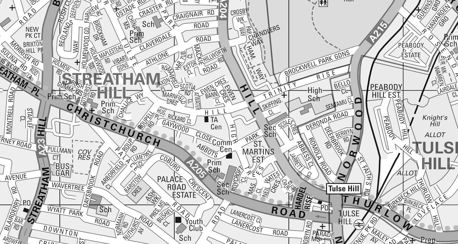
Electoral Boundary Maps
The latest 2023 constituency boundaries on A – Z mapping
If you need to accurately display the latest UK constituency boundaries, then we have the map data you need. Displayed over the instantly recognizable A – Z mapping.
Want to know more?